Monday, 12 December 2011

How does your media product represent particular social gorups?

The social group that I wanted my magazine to appeal to was people who listen to grime and who like it as well. I feel that my magazine should appeal to both genders, this is becuase grime is a multi-national thing and people are into it as well and it is growing and growing. I feel that my magazine should apply to ages from 16-24 because if it was to apply to all ages some people will not like it so I took that into practise and made my magazine apply to the youths of today. I chose my front cover to target my audience because I wanted it to relate to the youths of today and also make them feel that they are in the same shoes as the person on the front coer. I too into consideration the age and gender because when I was taking the photographs I wanted it to relate to the same ages of the audience but different in gender. This because nowadays there are more males than females of the grime system but it can be argued otherwise, so I took that into consideration.

This was the photo that I took for my magazine so that it appeals to my audience, I done this because I looked at a number of magazines and I thought that one particular stood out to me, and that was the LC magazine that a East London college had done. The magazine helped me in choosing the right kind of pictures to take and how to do it. So it helped me a lot in choosing the right picture and how to take it and relate it to my target audience.

In what ways does your media product use, develop or challenge forms and conventions of real media products?

Looking at my magazine I believe that it uses forms of convention. This has got to do with my title of my magazine. Possibly it may look like a real professional magazine I based my magazine like the magazine like mixmag but with a twist, unlike mixmag they use bright colours and effects but with my magazine the title is graffiti so it is conventional from the mixmag in a way becuase it relates to the younger generation. Well the style of writing fitted with my magazine because the style of font was related to the fact of graffiti which represents freedom and well living, also it expresses the fact it has a twist and most days we see graffiti on the streets. The font which was graffiti was black and white so it gives a sense of mystery and also
excitement I chose it becuase it made me feel that it could relate to my target audience and also the wider market. I believe that the two magazines are not similar because on of the magazines shows vibrant colours and freedom and the other shows a means of seriousness but good use of different colours to match the clothes or the stanza of the model in the front cover.
The main photo that I used was to relate to the target audience with a young person living out their dream as a music arist, it shows a sense of seriousness with the look of the model on the front cover. Also the colours that the model is wearing shows a sense of vibrance because with the colour of clothes that the model is wearing. I believe that the style fit with my magazine because it shows the reality of a person living out their dream so I think that the style fits in with the magazine.

Sunday, 11 December 2011

Market Research

I had to change the name of my superstar that I was doinng for my magazine. Also I had to change the person on my front cover, this is becuase in my first magazine although it was good the marketr didn't want to see a school boy on the fron page so I had to change it.
With the background as well the whole thing had to be done again because the market didn't like the view of my orginal magazine. Over time I started to develop my ideas and created a new front page magzine and when I showed it to the people via computer they were pleased and happy with the changes I had made to the front cover and how the colours and everything changed, in terms of the colour of the text, the type of font, the size of font and finally the image or person that I used on the front cover as well.

So this is what I changed:
  • the colour of the background
  • the person on the front page
  • the colour of text
  • the font size
  • the type of font
  • the structure of the front page
So here is the first magazine:


This is the second magazine:
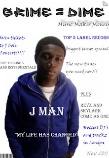


By looking at the two I made a lot of changes by the comment and reviews by my market.

Monday, 5 December 2011

Front Page Analysis

The reason why I choose my text was that it was made to speak to the reader, by showing them that the text I chose for example the grime=dime. It was chosen becuase I wanted it to make the reader feel that they will be apart of my magazine and the text was self-explaintory in my eyes. The style as well was in important becuase I don it so that the readers can read it and also relate to the type of text at the same time.
The text was also made in a way that it stands out so it appeals to the reader an whoever will read the magazine. It will also make them feel that they wrote the magazine themselves, so it was a good idea for me to choose the right text size.
I am happy with the way my magazine has turned out and I done it with the type of text and other bits and bobs to help me with my magazine.

Friday, 2 December 2011

Target Readers Analysis of doublepage spread

Looking at my double page spread I was able to get comments from a few potential readers. What I found out was that they liked the pictures that  I used in terms of the colour of the image and also the other images used for the double paged spread, also I found out that they liked the use of the colours matching what they say in the image. For example the gold and white and grey which they saw in the  image and also I used it as text so it match the clothes that they saw in the image and also the text as well.
Key Aspects
  • colour
  • text
  • images
  • arrangements of headings
The target readers also liked how I arranged the columns and the title and how they images weren't in the way of the text so it was clear to see. So overall the comment that I got from the different readers was very good, I also asked them if they were going to read the magazine would they buy it and they  all said yes, the reason why they said yes it because they liked the layout of the magazine and how I used the different colours as well. I also asked them what they  liked about  the magazine and all of them said the double page spread.

If they were to pick this magazine what would they like inside of the magazine and hopefully they said free CD's as it will urge them to buy more of the magazine because they  know that  they will get a free CD inside, which can suite their interest.

Monday, 28 November 2011

Photoshoot

The model for my photoshoot will be my friend Jerome Batsa and he will help in taking images for my front cover and other aspects of my magazine. The costume will be a range of clothes that will suit my interest for example a blue hoodie, black jumper and grey cardigan all of these colours costume can be used to help me with  my photoshoot.

Location:
  • Bishop Douglass School
  • Photograpy Room
Instruments:
  • Cannon Camera ( To take the images)
  • Lighting
  • White Backdrop
All of these points that II have mentioned will be used or  has been used in my photoshoot and it will help me in taking the  right images for example long shot, mid-shot, close up and high or low angle shot. These will help me with taking images in my photoshoot.
What I have learned from my prelimary task is that I was not able to use different shots to help me in that time, but the improvements and responses that I recieved helped me to improve my work and mak e it better. As I havesaid before there are good and bad things that went on with my prelimary task which will then help me with my coursework.