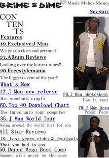
 With the contents page the significant thing about the layout of the contents page was the structure of the features and what to expect from the magazine. Also the colour was in fact to match the colours of the front cover so it continious, also the another reason is that one of it will be in silver and then blue and then back to silver so the colours will stand out. The features on the contents page was supposed to attract my audience for example the album reviews it was linked to appeal or to catch the attentionj of my audience. The font size for the headings was 22 and then for the little description was 18. This was done because the headings were supposed to stand out because it would be what the reader or audience wants to see when they turn over to the contents page, i placed it on the left hand side so it will the first thing that they will read when they turn over to the contents page.
 Monday, 12 December 2011
How did you attract/address your audience?
With the front cover as you can see the words that I used was to help me relate to the audience, in terms of the writing in blue it is similar to the title of the magazine but different in another way. Also with the other style of writing in silver it is in the means of a schoolboy writing so it relates to the target audience who of most are still in school. Moreover on the front cover I put freebies on it so I could promote my magazine and a lot of people like freebies, with the freebies I put " win tickets to J Cole concert" I done this so that the people who look at the magazine would like to buy it because they would like the free things within the magazine. The freebies are located in the top left corner of the magazine and it is in big so it will stand out to the reader and who will read it because it wil be the first thing that they will see.
 With the contents page the significant thing about the layout of the contents page was the structure of the features and what to expect from the magazine. Also the colour was in fact to match the colours of the front cover so it continious, also the another reason is that one of it will be in silver and then blue and then back to silver so the colours will stand out. The features on the contents page was supposed to attract my audience for example the album reviews it was linked to appeal or to catch the attentionj of my audience. The font size for the headings was 22 and then for the little description was 18. This was done because the headings were supposed to stand out because it would be what the reader or audience wants to see when they turn over to the contents page, i placed it on the left hand side so it will the first thing that they will read when they turn over to the contents page.
 With the contents page the significant thing about the layout of the contents page was the structure of the features and what to expect from the magazine. Also the colour was in fact to match the colours of the front cover so it continious, also the another reason is that one of it will be in silver and then blue and then back to silver so the colours will stand out. The features on the contents page was supposed to attract my audience for example the album reviews it was linked to appeal or to catch the attentionj of my audience. The font size for the headings was 22 and then for the little description was 18. This was done because the headings were supposed to stand out because it would be what the reader or audience wants to see when they turn over to the contents page, i placed it on the left hand side so it will the first thing that they will read when they turn over to the contents page.
Subscribe to:
Post Comments (Atom)

No comments:
Post a Comment