Monday, 31 October 2011
denotation and connotation
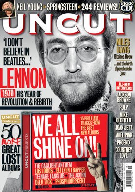
the magazine shown above show us the text and the differnet types of text used within the front cover. for example the font used and the colour. also the picture of the famous john lennon with his name in big font and looking straight ahead as well to create suspense. moreover the different types of sub heading moved across and looks like how is it listed down the right hand side of the page, also the CD place in the middle of the magazine but yet at at the bottom of the page.
compare and contrast
this is an image of mixmag magazine, the image on the front cover is a picture of DJ David Guetta standing with a little smurk with sunglasses. the masthead is yellow but the twist is that the font is the same but the "I" is different from the rest and the David Guetta is blocking the masthead but is does not really matter because you know what the masthead is anyway. the context from the front cover to the inside stories is that the colours will be the same in terms of the colour which is white and yellow which are the most use of colour.
this is an image of the clash which is a rock group. the sort of image is that is a medium close up shot and a four gropu shot as well. the text is good nice as well for example the masthead which is a big red colour and is going across the magazine, the sell lines are the inside story of the rock group and what they have done with each other and their ups and downs. the layout and design is very bright in terms with the lighting and the colours that are in front of the group shot. also the images from the front over to the inside stories are some what the same in terms of colour which is mostly used within the magazine.
Monday, 17 October 2011
Contents Page
This is my contents page. As you can see that it represents the life at the bishop by having the school kids working to represent the working environment in our school. what well was the choice of colour that can stand out with the pictures and the white background behind as well, what i can imorove is to use various text and see which ones will look better and to suite the magazine.
Also the school children working in the picture shows that together we are a catholic community and also what we have done through the years and that we are moving forward to achievement.
Looking at the contents page i can see thay in the near future it will become better and that it will look better for people as an improvement, the text of the contents which is in graffiti shows what the school is and also the kids who are within the school, and how the kids feel when outside of the school.
Wednesday, 12 October 2011
Language, Mode of address in a music magazine
the picture at the side was taking for a music magazine called mixmag. the language used in this photo is one of seriuos and at the same time mystery, for example the guy in the hat he looks mysterious because his eyes are covered with the hat and it is very dark, the one on the left looks serious but has a smurk at the same time this is also mysterious as well. the mode of address is serious because they are both wearing black and black is a dark and serious colour. what they are trying to get at that they are both serious and mysterious and that is the language used and also the mode of address.
Contens Page Flat Plan
Monday, 10 October 2011
Semiotic Theory
There are three kinds of signs in semiotic theory
1) Iconic signs- which acutally look like what they represent.
2) Symbolic/ arbitary- which have a meaning that must be culturally learned because they don't actually look like what they represent.
3) Indexical signs- which have a connection to what they represent and are suggestive rather than directly resembling what they represent.
Development of Contents Page
This picture is not my contents page i research it from the internet (Google Images) as it will help to do my content page for my college magazine and i wanted to post this so i can get an idea on how to do my content page and make it good to catch the readers eye. looking at this content page it looks like it for people who like houses and at the same time like the environment for example it says "How Green Are You?", moreover the use of colour and pictures highlight what the magazine will be about and how the reader may find it. i would say that the magazine is for couples who like houses and also fire places and furinture.
Gratification Theory
Use Of Gratifiaction Theory
Its a popualr approach to target the mass media. it assumes that members of the audience are not passive but take an active role in interpreting and integrating media into their own lives. also the approach suggest that people use the media to fulfill specfic gratification, moreover it shows the social and psychological needs of the individual.
Development of My Magazine
College Magazine
This is the first draft of my magazine and what it will look like in the future, there is going to be changes made so that when the final product is shown it will look nice and presentable and people will want to read it. The title of the magazine contents with the life of the student who are in sixth form as they have been here in bishop douglass the most. the background highlights the graffiti and the crown at the top, my target audience is the students of bishop douglass and other teenagers who are the same age as me showing them what they need to know for the near future.
My Target Audience
My target audience are secondary and teenage students who are currently in sixth form or in college. my magazine is based on the students of sixth form and college and aslo the magazine is mostly about school and exams and little bit and bobs about the different things that go on in school. the age for the readers are 16-19 and also using the student for the front cover of the magazine highlights the student life in bishop douglass and them being superior to the lower year, also there are some tips to success and also other things to help them with there work and univeristy choosings.
Identifying Your Typical Reader
This is Aaron Opuku he is 17 years old and live in Hendon North West London and is Ghanian. He is now in his 2nd year of college and is choosing his courses for university, he eats coco pops as it is a childhood cereal and it is his favourite all and also he like the way the cereal turns colour when he mixes it aroound. He drives his mums car and it is an audi A5 2008, he lives with his mother and father.
He likes a bit of Supermalt because of the flavour and the way it looks as wel, he like watching the Simpsons on channel 4, also ITV 1, 2,3 and 4 also he like watching BBC1 and 2 also he likes watching FX and comedy central. He likes to listen to R&B such as Usher, Justin Timberlake and Drake, his favourite meal is jellof rice and fufu as he likes a bit of home cooking.
He likes playing football and rugby, also he like Amercian Football. He is a single man he likes to go to Ghana for holiday to stay under the sun and meeting new people in new places. Aaron cannot vote as he is under age he he likes to go clubbing with his friends and the club is called club coco.
Flat plan
Here is an image of my flat plan for my college magazine as you can see it is just my flat plan but soon the real thing will come. You can see that the image and the title and also bit and bobs to catch the eye of the people who will read my magazine for college.
Tuesday, 4 October 2011
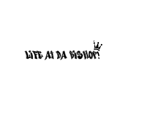
LIFE AT DA BISHOP
I have chosen this title because it represents the life of the students who have lived most of their lives at Bishop Douglass which to them is a life time but to others it is gaining experience and meeting new people. Also the "LIFE AT DA BISHOP!" represents the 6th form as they have been in Bishop Douglass the longest.
The exclamation point highlight the "BAM" at their lives spent at Bishop Douglass, also I done a research of this name and many people liked it as the graffti represents the students in terms of "DA", which is slag which us as students speak to each other.
Monday, 3 October 2011
THE LC
The layout of this magazine is the backgorund which is black and then it highlights the dancer who is wearing a light colour clothes which makes her and the backgroung light up, the title/masthead of the magazine is really marvellous in terms of the white in big writing for example the "the" which is turned side ways and then the "LC" which covers the dancers elbow.
Also the font size as well which is about in terms as "Large" which is big so that is stands out to the people who will read the magazine and the white as well which brings out the tension and happiness on the dancers face. The design overall is amazing so is the layout, the image copy is unique such as the dancer her pose is street and ballet at the same time which in other terms quite complicated at the same time.
Subscribe to:
Posts (Atom)