Friday, 16 December 2011
Monday, 12 December 2011
Looking back at your preliminary task, what do you fell you have learnt in progession from it to full product?
Looking back at my preliminary task I could see a lot of changes within the two magazines that I have done. In terms of my preliminary task the front cover was not that great, but by using the feedback that I received helped me in producing a better front which was done in my coursework magazine.
 This was my preliminary task as you can see the front cover was not that great, this is because I was use to the terms and technology of creating an outsatnding piece of work, also I tried to make it creative and also I felt that it appealed to my target audience, I believe that the target audience was addressed and this was related through the title of my preliminary task magazine. Also I made it look creative and also I made it look imaginative with the two pieces of work and also by deciding the different pictures to use and how it will relate to the target audience, by using people our age to relate to the target audience.
 This was my preliminary task as you can see the front cover was not that great, this is because I was use to the terms and technology of creating an outsatnding piece of work, also I tried to make it creative and also I felt that it appealed to my target audience, I believe that the target audience was addressed and this was related through the title of my preliminary task magazine. Also I made it look creative and also I made it look imaginative with the two pieces of work and also by deciding the different pictures to use and how it will relate to the target audience, by using people our age to relate to the target audience.
This is my coursework magazine. As you can see there is a big difference between the two in terms of how the feedback helped me in creating a better type of magazine and one that will be more appealing to my audience. The text was complete differnet because I wanted it to stand out and look good so that my target audience will be encouraged to read my magazine. The framing of the photo's worked as well becaue I was able to use different types of effects to help me with framing all of my pictures and text on my front cover.
I believe that my coursework magazine is more creative than my preliminary task. This is because it looks more creative in terms of text and framing of the images used in my coursework magazine. I also believe that it looks professional in terms of the second magazine because it looks well done and a lot of effort put into it. Overall I think that I have learnt a lot with the two magazines that I have created, and also the feedback that I have receieved regarding the two pieces of work that I have created, and also I hope that it will help me in the near future.
What have you learnt about technologies from the process of constructing this product?
The peice of technology that I used to help me in producing my magazine was photoimpact 10. This helped me because I was able to get the things and effects to help with my fron cover and contents page as well. It also helped me to edit photo's, change text layout and the size of the font in creating my front cover and contents page.

I also used dafont.com, it helped me in choosing the different the different types of fonts to help me with my magazine, this piece of technology helped me because I was able to get an idea of how my front page title will look like and if it will appeal to my audience, it also helped me because it gave me a list of fonts to choose from and helped me with my grime=dime title for my magazine.

Publisher helped me with my double page spread, this is because I was able to get the colour of font I wanted and also it helped me with inserting pictures and text boxes to write or type what I want to say for my audience to see. Why this helped me is becuase I was able to generate ideas on how to structure my double page spread and also the layout and templates that I used in order to make my double page spread and make it good not just for me but my audience.

I also used this camera and it is called FufiFilm FinePix S1500, this helped me in taking different images to insert into my magazine and also take multiple images as well. This helped me because I was able to take lots of different images and also helped me pick the right photo and put it on my magazine, also I was able to use the right types of shots and lighting as well.
I also used dafont.com, it helped me in choosing the different the different types of fonts to help me with my magazine, this piece of technology helped me because I was able to get an idea of how my front page title will look like and if it will appeal to my audience, it also helped me because it gave me a list of fonts to choose from and helped me with my grime=dime title for my magazine.
Publisher helped me with my double page spread, this is because I was able to get the colour of font I wanted and also it helped me with inserting pictures and text boxes to write or type what I want to say for my audience to see. Why this helped me is becuase I was able to generate ideas on how to structure my double page spread and also the layout and templates that I used in order to make my double page spread and make it good not just for me but my audience.
I also used this camera and it is called FufiFilm FinePix S1500, this helped me in taking different images to insert into my magazine and also take multiple images as well. This helped me because I was able to take lots of different images and also helped me pick the right photo and put it on my magazine, also I was able to use the right types of shots and lighting as well.
How did you attract/address your audience?
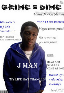
With the front cover as you can see the words that I used was to help me relate to the audience, in terms of the writing in blue it is similar to the title of the magazine but different in another way. Also with the other style of writing in silver it is in the means of a schoolboy writing so it relates to the target audience who of most are still in school. Moreover on the front cover I put freebies on it so I could promote my magazine and a lot of people like freebies, with the freebies I put " win tickets to J Cole concert" I done this so that the people who look at the magazine would like to buy it because they would like the free things within the magazine. The freebies are located in the top left corner of the magazine and it is in big so it will stand out to the reader and who will read it because it wil be the first thing that they will see.
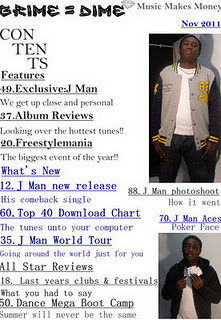 With the contents page the significant thing about the layout of the contents page was the structure of the features and what to expect from the magazine. Also the colour was in fact to match the colours of the front cover so it continious, also the another reason is that one of it will be in silver and then blue and then back to silver so the colours will stand out. The features on the contents page was supposed to attract my audience for example the album reviews it was linked to appeal or to catch the attentionj of my audience. The font size for the headings was 22 and then for the little description was 18. This was done because the headings were supposed to stand out because it would be what the reader or audience wants to see when they turn over to the contents page, i placed it on the left hand side so it will the first thing that they will read when they turn over to the contents page.
 With the contents page the significant thing about the layout of the contents page was the structure of the features and what to expect from the magazine. Also the colour was in fact to match the colours of the front cover so it continious, also the another reason is that one of it will be in silver and then blue and then back to silver so the colours will stand out. The features on the contents page was supposed to attract my audience for example the album reviews it was linked to appeal or to catch the attentionj of my audience. The font size for the headings was 22 and then for the little description was 18. This was done because the headings were supposed to stand out because it would be what the reader or audience wants to see when they turn over to the contents page, i placed it on the left hand side so it will the first thing that they will read when they turn over to the contents page.
 Who would be the audience for your media product?
This is called James Bandgow and he works as a chief in a top restaurant in London, he lives in West London in a house that he bought, he just came out of university and he is 20 years-old. He is single and lives with his friends the last three albums he has bought are Professor Green – At Your Inconvenience, Cee Lo Green- The Lady Killer and Wretch 32 Black and White these are the latest three albums he has got because he is a music fantic. James is a typical reader of this magazine and he likes listen to grime and his favourite artist or group is Boy Better Know.
Also this typical reader is someone who likes fashion and likes going to music concerts and also likes getting free tickets from different music radio stations that give away free tickets. His favourite radio station is Kiss fm.
James likes to drink a lot and have a blast on a Friday night. And likes reading about music magazines and the lives of the artist for example boy better know like in one of the magazines like mix mag and uncut. The reason is that these are the two that he likes to read a lot and has helped him with understanding the meaning of grime and how it came about to people of today.
His favourite TV show is the Simpsons, he watches it on a daily basis and does not miss one show of it. The reason why he watches it is because he has been watching it since he was a little child and also he likes the fact that it is a family show and can might relate to him and his family that is why he has loved it ever since.
What kind of media institution might distribute your media product and why?
Looking at the different publishers that publish magazine for example:
I feel that the publishers of mixmag which are Development Hell can distribute my media product because the produce over 21,500 copies in Britain alone, so I feel that they can publish my media product. By this they can distribute to the wider market which is good for me by making profits and advertising sales as well. Also I feel that by choosing Develpment Hell they can relate to what I am publishing and why I am doing it as well, moreover I feel that they can take me further becuase they produce lots of copies and maybe it can influence other distributors to buy my media product and sell it in there market.
- mixmag
- uncut
- NME
- IPC media
- Development Hell
- Tracey Cheesman
- Paul Cheal
I feel that the publishers of mixmag which are Development Hell can distribute my media product because the produce over 21,500 copies in Britain alone, so I feel that they can publish my media product. By this they can distribute to the wider market which is good for me by making profits and advertising sales as well. Also I feel that by choosing Develpment Hell they can relate to what I am publishing and why I am doing it as well, moreover I feel that they can take me further becuase they produce lots of copies and maybe it can influence other distributors to buy my media product and sell it in there market.
How does your media product represent particular social gorups?
The social group that I wanted my magazine to appeal to was people who listen to grime and who like it as well. I feel that my magazine should appeal to both genders, this is becuase grime is a multi-national thing and people are into it as well and it is growing and growing. I feel that my magazine should apply to ages from 16-24 because if it was to apply to all ages some people will not like it so I took that into practise and made my magazine apply to the youths of today. I chose my front cover to target my audience because I wanted it to relate to the youths of today and also make them feel that they are in the same shoes as the person on the front coer. I too into consideration the age and gender because when I was taking the photographs I wanted it to relate to the same ages of the audience but different in gender. This because nowadays there are more males than females of the grime system but it can be argued otherwise, so I took that into consideration.
This was the photo that I took for my magazine so that it appeals to my audience, I done this because I looked at a number of magazines and I thought that one particular stood out to me, and that was the LC magazine that a East London college had done. The magazine helped me in choosing the right kind of pictures to take and how to do it. So it helped me a lot in choosing the right picture and how to take it and relate it to my target audience.
This was the photo that I took for my magazine so that it appeals to my audience, I done this because I looked at a number of magazines and I thought that one particular stood out to me, and that was the LC magazine that a East London college had done. The magazine helped me in choosing the right kind of pictures to take and how to do it. So it helped me a lot in choosing the right picture and how to take it and relate it to my target audience.
In what ways does your media product use, develop or challenge forms and conventions of real media products?
Looking at my magazine I believe that it uses forms of convention. This has got to do with my title of my magazine. Possibly it may look like a real professional magazine I based my magazine like the magazine like mixmag but with a twist, unlike mixmag they use bright colours and effects but with my magazine the title is graffiti so it is conventional from the mixmag in a way becuase it relates to the younger generation. Well the style of writing fitted with my magazine because the style of font was related to the fact of graffiti which represents freedom and well living, also it expresses the fact it has a twist and most days we see graffiti on the streets. The font which was graffiti was black and white so it gives a sense of mystery and also
 excitement I chose it becuase it made me feel that it could relate to my target audience and also the wider market. I believe that the two magazines are not similar because on of the magazines shows vibrant colours and freedom and the other shows a means of seriousness but good use of different colours to match the clothes or the stanza of the model in the front cover.
 excitement I chose it becuase it made me feel that it could relate to my target audience and also the wider market. I believe that the two magazines are not similar because on of the magazines shows vibrant colours and freedom and the other shows a means of seriousness but good use of different colours to match the clothes or the stanza of the model in the front cover.
The main photo that I used was to relate to the target audience with a young person living out their dream as a music arist, it shows a sense of seriousness with the look of the model on the front cover. Also the colours that the model is wearing shows a sense of vibrance because with the colour of clothes that the model is wearing. I believe that the style fit with my magazine because it shows the reality of a person living out their dream so I think that the style fits in with the magazine.
Sunday, 11 December 2011
Market Research
I had to change the name of my superstar that I was doinng for my magazine. Also I had to change the person on my front cover, this is becuase in my first magazine although it was good the marketr didn't want to see a school boy on the fron page so I had to change it.
With the background as well the whole thing had to be done again because the market didn't like the view of my orginal magazine. Over time I started to develop my ideas and created a new front page magzine and when I showed it to the people via computer they were pleased and happy with the changes I had made to the front cover and how the colours and everything changed, in terms of the colour of the text, the type of font, the size of font and finally the image or person that I used on the front cover as well.
So this is what I changed:

This is the second magazine:
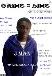
By looking at the two I made a lot of changes by the comment and reviews by my market.
With the background as well the whole thing had to be done again because the market didn't like the view of my orginal magazine. Over time I started to develop my ideas and created a new front page magzine and when I showed it to the people via computer they were pleased and happy with the changes I had made to the front cover and how the colours and everything changed, in terms of the colour of the text, the type of font, the size of font and finally the image or person that I used on the front cover as well.
So this is what I changed:
- the colour of the background
- the person on the front page
- the colour of text
- the font size
- the type of font
- the structure of the front page

This is the second magazine:

By looking at the two I made a lot of changes by the comment and reviews by my market.
Monday, 5 December 2011
Front Page Analysis
The reason why I choose my text was that it was made to speak to the reader, by showing them that the text I chose for example the grime=dime. It was chosen becuase I wanted it to make the reader feel that they will be apart of my magazine and the text was self-explaintory in my eyes. The style as well was in important becuase I don it so that the readers can read it and also relate to the type of text at the same time.
The text was also made in a way that it stands out so it appeals to the reader an whoever will read the magazine. It will also make them feel that they wrote the magazine themselves, so it was a good idea for me to choose the right text size.
I am happy with the way my magazine has turned out and I done it with the type of text and other bits and bobs to help me with my magazine.
Friday, 2 December 2011
Target Readers Analysis of doublepage spread
Looking at my double page spread I was able to get comments from a few potential readers. What I found out was that they liked the pictures that I used in terms of the colour of the image and also the other images used for the double paged spread, also I found out that they liked the use of the colours matching what they say in the image. For example the gold and white and grey which they saw in the image and also I used it as text so it match the clothes that they saw in the image and also the text as well.
Key Aspects
If they were to pick this magazine what would they like inside of the magazine and hopefully they said free CD's as it will urge them to buy more of the magazine because they know that they will get a free CD inside, which can suite their interest.
Key Aspects
- colour
- text
- images
- arrangements of headings
If they were to pick this magazine what would they like inside of the magazine and hopefully they said free CD's as it will urge them to buy more of the magazine because they know that they will get a free CD inside, which can suite their interest.
Monday, 28 November 2011
Photoshoot
The model for my photoshoot will be my friend Jerome Batsa and he will help in taking images for my front cover and other aspects of my magazine. The costume will be a range of clothes that will suit my interest for example a blue hoodie, black jumper and grey cardigan all of these colours costume can be used to help me with my photoshoot.
Location:
What I have learned from my prelimary task is that I was not able to use different shots to help me in that time, but the improvements and responses that I recieved helped me to improve my work and mak e it better. As I havesaid before there are good and bad things that went on with my prelimary task which will then help me with my coursework.
Location:
- Bishop Douglass School
- Photograpy Room
- Cannon Camera ( To take the images)
- Lighting
- White Backdrop
What I have learned from my prelimary task is that I was not able to use different shots to help me in that time, but the improvements and responses that I recieved helped me to improve my work and mak e it better. As I havesaid before there are good and bad things that went on with my prelimary task which will then help me with my coursework.
Monday, 21 November 2011
Sunday, 20 November 2011
Tuesday, 15 November 2011
New and improved front cover

This is my improved front cover for my coursework and the title of the magazine is called grime = dime. the predominant colours are blue, white and silver. the jewllery shows the dime when it come to grime which means that music equals money and this is shown on the front cover.
The colour of the text matches the hoodie, the colours of the chain and the t-shirt these colours as been expressed through the writing of the front cover. The diamond at the end symbolises the wealth and value, and the " money all the time" phrase also shows the success. But all in all I am well pleased with the work I have done.
Monday, 14 November 2011
Evaluating Images so far!
I would say that the quality of the images I have produced is good standards as in terms of the different angles and shots that I took. also the quality of the image so far is good because I used the surroundings to help me for example lighting and the background in which I took my photo's from. I believe that the level of colours used is appropraite because I wanted the colour of the writing and the different colours of the photo's to match so I believe that the level of colours used are very appropriate.
The images used would appeal to my intented auidence because the colours and the photo had to match or be similar in my eyes because as we know my magzine auidence is the youth of today or shall I say school kids, and also they look at the little features and see if it is good or not. Yes it is appealing in terms of visual style because for me it stands out because it has to look good for me to get the good grades and make it happen.
The images used would appeal to my intented auidence because the colours and the photo had to match or be similar in my eyes because as we know my magzine auidence is the youth of today or shall I say school kids, and also they look at the little features and see if it is good or not. Yes it is appealing in terms of visual style because for me it stands out because it has to look good for me to get the good grades and make it happen.
Evaluation photo's
My photo's I believe are very good in terms of shots and how I used the different shots to my advantage. There are good and bad these that are good with my pictures first of all the good thing about my pictures is that how I used the different shot like medium close up or long range close up, I took all these things into consideration and made different photo's that can be suitable for my magazine. I believe that I have achieved the objective of my flatplan because I put the effort into the work to make it good not just for me but my peers and other people as well. I am sure that my photo's are technically correct for example the different shots I used so that I can decide on what picture to use and which one will be more suitable for my magazine.
On the other hand the bad thing I would say and need to improve upon is the person I used for the photo's, don't get me wrong the person who I took the photo for was great. But the matter was that I took the picture in his school clothes and the magazine is suppose to be for a music magazine not for artist to wear school clothes, so this is the thing that I need to imporve on and take into consideration and not make that mistake again.
On the other hand the bad thing I would say and need to improve upon is the person I used for the photo's, don't get me wrong the person who I took the photo for was great. But the matter was that I took the picture in his school clothes and the magazine is suppose to be for a music magazine not for artist to wear school clothes, so this is the thing that I need to imporve on and take into consideration and not make that mistake again.
Semiotic Theory Lesson
Semiotics- Study of means and signs
motivated signs
Signs can be more or less motivated. Loosing motivated it is open to different theories. The latter takes a lot of individual interpretation. people have different views on different people, a more motivational sign just has more limited range of possible interpretation. There was a example where the teacher showed a picture of a baby and then we used connotation and dennotation to work it out and there was lots of different views such as is it a boy or girl and we had to use hte clothing to determine if it was a boy or girl, or could it be a son, daughter, nephew or niec . Later on we saw another picture of the baby with the father and then we realised that is the fathers son.
- iconic signs-which actually looks like what they represent
- symbolic signs-which have a meaning that must be cultrally learned to what they represent
- indexical signs-which have a connection to what they represent and are suggestive rather than directly resembling what they represent
- saussure (1954) and barthes (1972)
- plysemic meaning-the way that the same sign can mean lots of different things to different people.
motivated signs
Signs can be more or less motivated. Loosing motivated it is open to different theories. The latter takes a lot of individual interpretation. people have different views on different people, a more motivational sign just has more limited range of possible interpretation. There was a example where the teacher showed a picture of a baby and then we used connotation and dennotation to work it out and there was lots of different views such as is it a boy or girl and we had to use hte clothing to determine if it was a boy or girl, or could it be a son, daughter, nephew or niec . Later on we saw another picture of the baby with the father and then we realised that is the fathers son.
Sunday, 13 November 2011
Front cover coursework and improvements
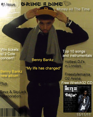 This is my front cover for my coursework and the title of the magazine is called grime = dime. the predominant colours are gold, white black and grey. As you can see the colours match the person clothes and also the background as well, the jewllery shows the dime when it come to grime which means that music equals money and this is shown on the front cover.
The colour of the text match the scarf, the colours of the hat and the watch and the bracelet of the person and these colours as been expressed through the writing of the front cover. The diamond at the end symbolises the wealth, and the " money all the time" phrase also shows the success. But all in all I am well pleased with the work I have done and I hope other people will like it as well.
I will have to make a new cover. This is becuase my feedback was that there should not have been a student for front cover because it does not look like an artist but more of a schoolboy photo, also another critism was that I should not put a cd cover but just say it as in text for example the wretch 32 album should not be there. Also the barcode is too big and my feedback was that I should make it smaller and also make my title bigger so that people can see it, moreover I should make a new phrase so that it will sound better. So on the feed back I have recieved I will make a new and imporved front cover
Tuesday, 8 November 2011
Market Research
What kind of questions do you as the target audience expect from a music magazine. In terms of what do guys expect from a music magazine is it:
- fun or serious
- colourful or dull
- interviews or gossips
- clubs and festivals
- music
Monday, 7 November 2011
What do YOU want to do???
Personally my personal preference of the magazines that I have researched for example Mix Mag is very good. This is hwy because Mix Mag is a type of magazine that puts social and lifestyle together and also I liek the way that use the colours within the whole magazine as well. I like the fact that music and life is put onto one magazine and relates to different types of soical and psychological needs of different readers who read this magazine. Also it brings entertainment and serious for example the entertainment is the mentioning of different clubs and the seriouness is the article on the lives of different artist as well. I would personally be a part of the target audience for a magazine like Mix Mag.
Gratification theory
The social needs of a reader reading mix mag is one to go out to party and be like other people. Also the social needs of a reader is like to be the people that they are reading for example the article about Plan B, someone who is reading that would want to be like him in terms of social needs. The sense of personal identity is finding out who the reader is by reading the mix mag magazine, also the music that they promote as well for example the pop music and many other the reader would want to listen to these types of music and a sense of belonging to a different social needs. Mix mag brings a sense of belonging to its readers by advertsising festivals so that other people can come and enjoy themselves and have a good time and meet new people who they never met before. Also they put pictures of people who like to party and have a good time, this is psychological need because they want to be with people and do something that is out of the norm. The form of entertainment that mix mag provides to its readers is by putting up different pictures of different clubs with people having a good time for example bubbles when people are clubbing then bubbles and smoke start to come out or they can have glow sticks and start dancing. This entertainment brings a sense of escaspism because they want to do things that are not normal and have fun for example as I said using the bubble machine and haveing glow sticks is it not normal and that is a psychological need because it is not normal.
Wednesday, 2 November 2011
Flatplan of Front cover and Double page spread
These are the images of my flatplan of my front cover and double page spread. As you can see that it is for a music magazine with artist in the front cover and asking him or her questions and other things on the double spread page. This is not the real thing but hopefully the real thing will be good.
 Giving example of the front cover will be the masthead and the different sort of text and images that will be on the front cover in the real thing.
Looking at my double page spread you can see that it has the mast head at the top going across with the phrase at the other side. And the different text boxes respresents the text that will be used and at the bottom a picture of the artist will be place in the real magazine this is just the flat plan. Using some of the text boxes as an example one question would be the history of the artist and how they wanted to become and artist and what persuaded him or her to become an artist.
Tuesday, 1 November 2011
Music Magazine Typical Reader
Evaluation of prelimary task
looking over my magazine i would say that are some good things and some bad things wrong with my prelimary task. first of all what was wrong with my magazine was that I did not use the correct tools to tamper with to get the proper feeling of the work, also what was wrong with my magazine was that I did not do enough research for my contents page which would have helped me to improve my contents page and make it look better. another point is that I did not use various shots for example medium close up or two shot and also I did not use lighting for effect of my images, that was another reason why my magazine was not up to standards.
the good thing that was good about my magazine was the use of colours that I used for my contents page and also the masthead for my front cover. moreover I used different most ict skills such as copying and pasting but you can say that is a bad thing because i did not use any picture tools as well. but overall by looking at my magazine it was good but there is a need of improvements to mkae my magazine better.
the good thing that was good about my magazine was the use of colours that I used for my contents page and also the masthead for my front cover. moreover I used different most ict skills such as copying and pasting but you can say that is a bad thing because i did not use any picture tools as well. but overall by looking at my magazine it was good but there is a need of improvements to mkae my magazine better.
Research A Music Magazine
Title: MixMag
Price £4.20
Publisher: Development Hell Ltd
Frequency of publication: Monthly
What mode of address is being used on the front cover? the mode of address on the front cover of the magazine is vibrant for example the colour of the front colour which is yellow and pink.
What in particular is being promoted about the magazine and the editoral view on music? To go and see different types of clubs and festivals. The view on music is some what popular because for each page there are different types of music for example funky house.
What percentage of image text is there in the magazine ( try a guesstimate) 80 or 90%
Read a feature about a band/artist and make comments on the language used.
Price £4.20
Publisher: Development Hell Ltd
Frequency of publication: Monthly
What mode of address is being used on the front cover? the mode of address on the front cover of the magazine is vibrant for example the colour of the front colour which is yellow and pink.
Music promotion | Lifestyle | Classified ads | Other | |
Number of times occurring | 16 | 6 | 11 | 1 |
Name of the product being advertised | South West Four ( London Clapham Common) | Fashion ( jeans and shoes) | Mobile phones | Cd’s |
Where in the magazine does the advert appear | 8th page | 84th page | 104th page | Front cover |
What cost is the product (provide a guesstimate) | £20 | £25-£30 | £40 | £10-£15 |
What in particular is being promoted about the magazine and the editoral view on music? To go and see different types of clubs and festivals. The view on music is some what popular because for each page there are different types of music for example funky house.
What percentage of image text is there in the magazine ( try a guesstimate) 80 or 90%
Read a feature about a band/artist and make comments on the language used.
- Use of slang: No slang is used in this feature
- Is the written text formal or informal? Informal for example it has got swearing
- The quality of what is being written? There is a lot of quality written for example his life and history in the music industry
- Is the article humorous or serious? Serious
- Is the artist being promoted or publicised? Publicised because it is talking about the artists life
- Does the artist have a new release due? Yes 2010
- What is the tone of the article? Serious and foul lanugaged
Monday, 31 October 2011
denotation and connotation
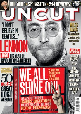
the magazine shown above show us the text and the differnet types of text used within the front cover. for example the font used and the colour. also the picture of the famous john lennon with his name in big font and looking straight ahead as well to create suspense. moreover the different types of sub heading moved across and looks like how is it listed down the right hand side of the page, also the CD place in the middle of the magazine but yet at at the bottom of the page.
compare and contrast
Monday, 17 October 2011
Contents Page
This is my contents page. As you can see that it represents the life at the bishop by having the school kids working to represent the working environment in our school. what well was the choice of colour that can stand out with the pictures and the white background behind as well, what i can imorove is to use various text and see which ones will look better and to suite the magazine.
Also the school children working in the picture shows that together we are a catholic community and also what we have done through the years and that we are moving forward to achievement.
Looking at the contents page i can see thay in the near future it will become better and that it will look better for people as an improvement, the text of the contents which is in graffiti shows what the school is and also the kids who are within the school, and how the kids feel when outside of the school.
Wednesday, 12 October 2011
Language, Mode of address in a music magazine
 the picture at the side was taking for a music magazine called mixmag. the language used in this photo is one of seriuos and at the same time mystery, for example the guy in the hat he looks mysterious because his eyes are covered with the hat and it is very dark, the one on the left looks serious but has a smurk at the same time this is also mysterious as well. the mode of address is serious because they are both wearing black and black is a dark and serious colour. what they are trying to get at that they are both serious and mysterious and that is the language used and also the mode of address.
Contens Page Flat Plan
Monday, 10 October 2011
Semiotic Theory
There are three kinds of signs in semiotic theory
1) Iconic signs- which acutally look like what they represent.
2) Symbolic/ arbitary- which have a meaning that must be culturally learned because they don't actually look like what they represent.
3) Indexical signs- which have a connection to what they represent and are suggestive rather than directly resembling what they represent.
Development of Contents Page
Gratification Theory
Use Of Gratifiaction Theory
Its a popualr approach to target the mass media. it assumes that members of the audience are not passive but take an active role in interpreting and integrating media into their own lives. also the approach suggest that people use the media to fulfill specfic gratification, moreover it shows the social and psychological needs of the individual.
Its a popualr approach to target the mass media. it assumes that members of the audience are not passive but take an active role in interpreting and integrating media into their own lives. also the approach suggest that people use the media to fulfill specfic gratification, moreover it shows the social and psychological needs of the individual.
Development of My Magazine
College Magazine
This is the first draft of my magazine and what it will look like in the future, there is going to be changes made so that when the final product is shown it will look nice and presentable and people will want to read it. The title of the magazine contents with the life of the student who are in sixth form as they have been here in bishop douglass the most. the background highlights the graffiti and the crown at the top, my target audience is the students of bishop douglass and other teenagers who are the same age as me showing them what they need to know for the near future.
My Target Audience
My target audience are secondary and teenage students who are currently in sixth form or in college. my magazine is based on the students of sixth form and college and aslo the magazine is mostly about school and exams and little bit and bobs about the different things that go on in school. the age for the readers are 16-19 and also using the student for the front cover of the magazine highlights the student life in bishop douglass and them being superior to the lower year, also there are some tips to success and also other things to help them with there work and univeristy choosings.
Identifying Your Typical Reader
This is Aaron Opuku he is 17 years old and live in Hendon North West London and is Ghanian. He is now in his 2nd year of college and is choosing his courses for university, he eats coco pops as it is a childhood cereal and it is his favourite all and also he like the way the cereal turns colour when he mixes it aroound. He drives his mums car and it is an audi A5 2008, he lives with his mother and father.
He likes a bit of Supermalt because of the flavour and the way it looks as wel, he like watching the Simpsons on channel 4, also ITV 1, 2,3 and 4 also he like watching BBC1 and 2 also he likes watching FX and comedy central. He likes to listen to R&B such as Usher, Justin Timberlake and Drake, his favourite meal is jellof rice and fufu as he likes a bit of home cooking.
He likes playing football and rugby, also he like Amercian Football. He is a single man he likes to go to Ghana for holiday to stay under the sun and meeting new people in new places. Aaron cannot vote as he is under age he he likes to go clubbing with his friends and the club is called club coco.
Flat plan
Here is an image of my flat plan for my college magazine as you can see it is just my flat plan but soon the real thing will come. You can see that the image and the title and also bit and bobs to catch the eye of the people who will read my magazine for college.
Tuesday, 4 October 2011
LIFE AT DA BISHOP
 I have chosen this title because it represents the life of the students who have lived most of their lives at Bishop Douglass which to them is a life time but to others it is gaining experience and meeting new people. Also the "LIFE AT DA BISHOP!" represents the 6th form as they have been in Bishop Douglass the longest.
The exclamation point highlight the "BAM" at their lives spent at Bishop Douglass, also I done a research of this name and many people liked it as the graffti represents the students in terms of "DA", which is slag which us as students speak to each other.
Monday, 3 October 2011
THE LC
The layout of this magazine is the backgorund which is black and then it highlights the dancer who is wearing a light colour clothes which makes her and the backgroung light up, the title/masthead of the magazine is really marvellous in terms of the white in big writing for example the "the" which is turned side ways and then the "LC" which covers the dancers elbow.
Also the font size as well which is about in terms as "Large" which is big so that is stands out to the people who will read the magazine and the white as well which brings out the tension and happiness on the dancers face. The design overall is amazing so is the layout, the image copy is unique such as the dancer her pose is street and ballet at the same time which in other terms quite complicated at the same time.
Also the font size as well which is about in terms as "Large" which is big so that is stands out to the people who will read the magazine and the white as well which brings out the tension and happiness on the dancers face. The design overall is amazing so is the layout, the image copy is unique such as the dancer her pose is street and ballet at the same time which in other terms quite complicated at the same time.
Subscribe to:
Comments (Atom)


